First gracing our cinemas almost 15 years ago, the Devil Wears Prada remains, in my opinion, a necessary element of anybody’s film diet. Starring Anne Hathaway and Meryl Streep, the film delves into the world of fashion publication – focusing on the relationship between a fashion magazine’s editrix and her assistant. The film’s primary ‘antagonist’ – though there is a real case to be made for Hathaway’s on-screen boyfriend fulfilling this role – is Miranda Priestly, the aforementioned editrix of a renowned fashion magazine, played by Streep. Most of the stellar moments in the film are easily attributable to Miranda Priestly (and Streep’s performance), one of the most iconic instances being her soliloquy lecturing Andrea Sachs (played by Hathaway) on the exact difference between turquoise and cerulean. In it, Priestly delves into a brief history of the color cerulean – the genesis of its popularity, the proliferation of cerulean within high fashion, and its eventual appearance in mass production of the clothes Sachs herself wears.
It got me thinking, then, of the sheer ubiquity of color in our everyday fashion choices. Beyond the simple coordination of an aesthetic, however, color seems to permeate every aspect of the manner in which we present ourselves – it can represent a mood, emotion, or choice. With that in mind, I decided to venture down the rabbit hole of the most iconoclastic color I could think of. Pink. Or, to be more specific, millennial pink.
It may appear hyperbolic to refer to a color as iconoclastic, but Pantone's 2016 Color of the Year is so much more than just a pigment. It is, as the Cut writes, "the genderless mascot" of a generation in which 50% believe that gender runs on a spectrum. Millennial Pink is often cited as the symbol of a growing movement towards gender neutrality, in contrast with years of fashion and sociological history that have paraded pink as a figurehead for femininity and traditional norms of womanhood. Interestingly enough, its growing prominence also has ties to film culture and interior design (think Wes Anderson). Technology is involved too – look no further than Apple's troupe of rose gold tinted devices. And perhaps most bizarrely, there is also a scientific dimension to this – lengthy studies and explanations for just why millennial pink is just so riveting to look at.
The assumed female preference for pink, or reddish-hued colors, is an obvious product of years of cultural conditioning within Western culture. A 2013 study comparing color preferences between Namibian and British women found that Namibian women, belonging to a "nonindustrialized culture" and "free from the common influence of global consumer culture", did not adhere to traditional sex differences in color preferences. The conventional difference in color preference being, of course, that men prefer blue while women tend towards pink. This trend did not truly pick up until after World War II, according to historian Jo Paoletti, and even then, "it didn't gel until the 1980s." Clothing manufacturers essentially marketed pink as being for girls, and blue for boys – perhaps reflecting the influences of French fashion that used the same pairing. Another potential reason for the feminization of pink is First Lady Mamie Eisenhower. The First Lady, famously obsessed with the color, all but created the dutiful housewife archetype that was so popular in the 50s. As a result, "Mamie pink" begun to be associated with the idealized trope of a 50s housewife, and amassed significant popularity in consumer culture.

Sociologist Philip Cohen argues that this sort of marketing stemmed from the resolve to sell gender normativity. Since "being 'gender normal' is very important to us...if retailers can convince you that being gender normal means you need to buy a certain product — cosmetics, plastic surgery, blue or pink clothing, etc" then consumers would automatically buy into a marketing strategy enforcing the gender binary through color.
Indeed, pink has long been touted as an ultimate symbol of femininity and girlishness – this is not necessarily new information. But it has also been used to represent a different type of femininity – a far more radical kind.At the peak of Grunge Fashion in the 90s, female punk groups reclaimed "girly" details like heart motifs and the color pink, setting the tone for the third wave of feminism.
But what constitutes millennial pink? While there has been much debate about the exact shade, most agree that it is "dusty nude concoction creating a barely-there pastel, a just-about-pink pink".

The sheer ubiquity of millennial pink is best representative of the generation's rejection of the traditional gender dichotomy. Pink has generally been used to enforce a particular binary, even when used as a mechanism of female empowerment, it remained relatively exclusive to women. Now, however, millennial pink has garnered significant attention as a menswear shade, appearing at menswear shows "as the color of the age of gender fluidity".
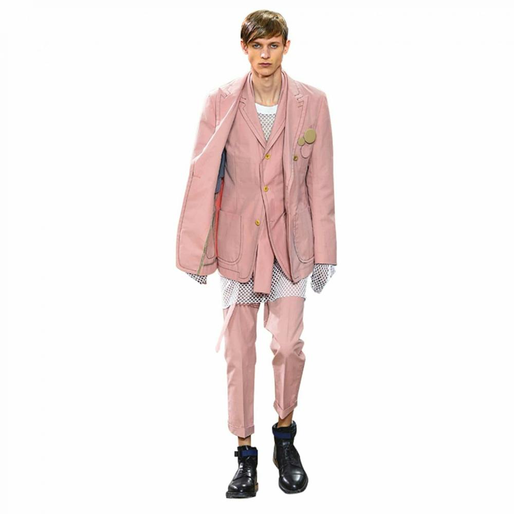
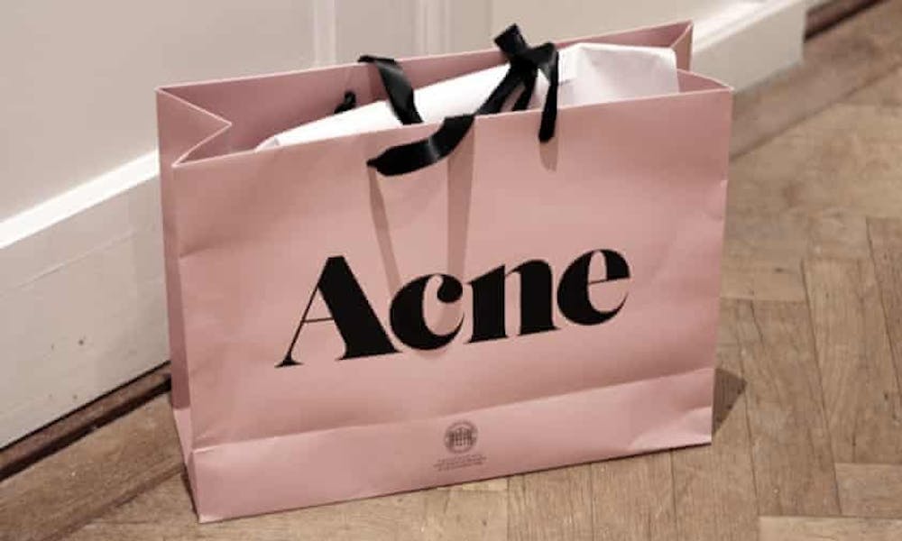
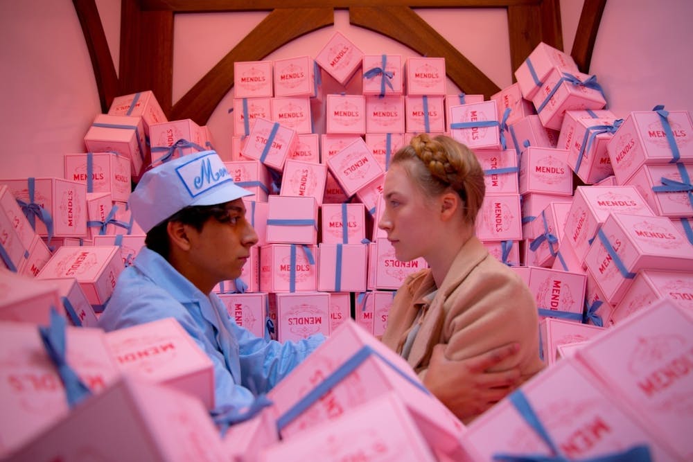
In terms of the growing popularity of millennial pink, differing sources credit varying moments as propelling its success. The Cut published an extensive timeline detailing appearances of the shade from Fragonard's painting 'The Swing' in 1767, to Acne Studios debuting its infamous pink shopping bag in 2017. An oft-cited example, however, remains Wes Anderson's 2014 film, The Grand Budapest Hotel. The kitsch masterpiece featured set designs enveloped in millennial pink and red tones, as well as embodying "eternal spring pinks...[that] explode on the screen like an overstuffed bag of cake icing".
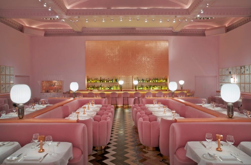
However, Anderson was not the first to incorporate the pink into set designs: a year prior, Scandinavian design companies such as Muuto, Normann Copenhagen and Space Copenhagen used the color in countless furnishings and decor under the moniker 'Scandi Pink'. Their designs took Pinterest and Instagram by storm – redefining what it meant to be 'aesthetic' in the modern era. That same year, India Mahdavi restyled the interiors for the Gallery at Sketch restaurant in London, incorporating a combination of plush pink velvet and pink walls that she would go on to reuse at Red Valentino stores. Millennial pink's popularity in interior design can be partially attributed to its aforementioned sense of androgyny – and what it represents in terms of gender fluidity. However, it also attracts reverence for it's aesthetic value. It is "soft without falling into the banal.....and showcases a sort of ironic beauty", as well as pairing well with other colors. Moreover, millennials pink also holds an intrinsic form of nostalgia, as a color "associated with innocence".
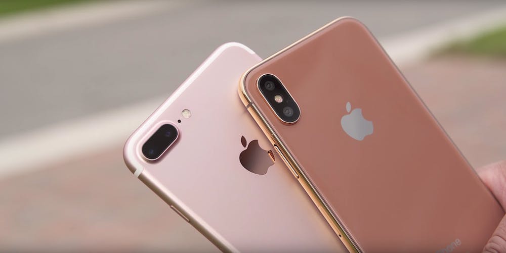
In September 2015, Apple capitalized on the millennial pink frenzy, albeit with a metallic twist. Rose gold was borne of the same craze and success that dogged millennial pink, and it was an instant hit. Forty percent of all preorders for the iPhone 6S were for the rose gold model. According to Marie Claire's fashion editor Penny Goldstone, millennials held a preference for rose gold "almost as a sort of psychological protest against the many world events of 2016 that they found depressing". She continues: "Pink used to be scorned, but with the rise of millennials, it was almost seen as a cool thing because it's kind of ironic", says Goldstone. With the occurrence of several calamitous events in 2016, people "just wanted to focus on something positive".
Crediting millennial pink with holding magical properties of instigating psychological wellness may seem like a stretch - but there is actually scientific evidence behind these claims. In the 1970s, researcher Alexander Schauss studied the effects of Baker-Miller Pink (a shade similar to Millennial Pink) by painting cell walls pink at the Washington State Department of Corrections and subsequently observing inmate behavior. Schauss observed that the color resulted in a short-term decrease in aggression and blood pressure. However, his findings were repudiated by another study in 1988 that concluded the color had no effect on human behavior at all. Nonetheless, there is an abundance of evidence suggesting that pink is tied to femininity and female qualities as a result of Western cultural programming. Due to the inherent association of positive concepts of softness or gentleness with 'girlishness', it has been hypothesized that our positive reactions to pink are drawn from these same cultural ideas. In 2002, researchers in Switzerland found that people were 12% more likely to fill out a questionnaire if it was printed on pink paper. This suggests that there is some level, however limited, of scientific reasoning behind the affinity for millennial pink.
As contradictory as it sounds, however, millennial pink is not particularly special. Most colors share similar extensive histories, though perhaps not studied or documented to the same extent, that span multiple disciplines and intersections. The point, rather, is to remember the principle of Priestly's original argument – that choices in style are usually much, much deeper than they may seem. It also serves as a reminder that fashion runs deeper in the fabric of society than most anticipate – and that nobody is truly above it.

