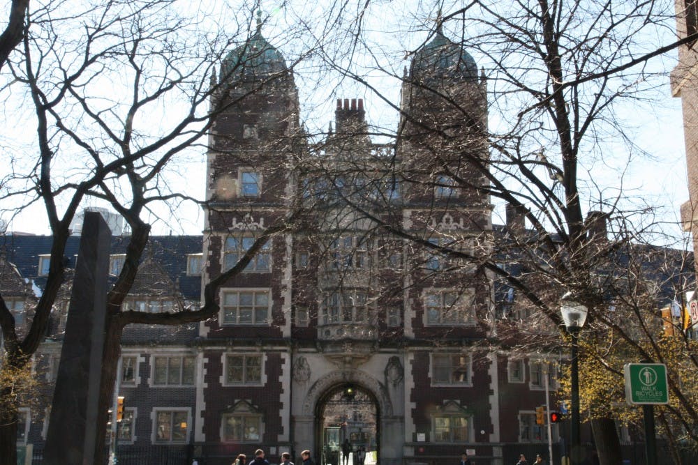
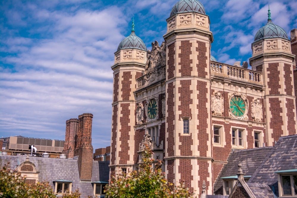
For anyone familiar with Penn Housing, it’s easy to say that the housing facilities aren’t exactly prime. Rooms are small, buildings are infested with vermin and their offspring, and when nothing is leaking, there’s an elevator broken somewhere. Regardless, what makes up for the somewhat lackluster interior is its facade. I’m referring to, of course, the Quad.
The Quad is perhaps the perfect embodiment of the abundance, maybe even overabundance, of the Collegiate Gothic Style, an architectural subset of the Gothic Revival movement, found here at Penn. With its sharp—edged square columns that make up Memorial Tower and its rounded dome colored by alternating stripes of red and white that define Provost Tower, the Quad is a perfect reflection of a balance between rigidity and motion. Meanwhile, the arcades connecting the courtyard and the rounded windows of McClelland are countered by the triangular pathways throughout the area.
It was built in the late 19th century and designed by the Philadelphia—based architectural firm Cope and Stewardson which was headed by Walter Cope, an alum of Penn’s architectural department, and John Stewardson. The Quad was influenced by the British architectural style on the Oxford and Cambridge campuses. The firm tried to infuse similar Jacobean, a more Baroque version of the strict Elizabethan style that Britain adopted during the Renaissance, and Gothic styles.
Even though there are pointed arches and ornate details at the borders of the structure that are characteristic of Gothic style, Neoclassical elements like columns, metopes, and triglyphes are mixed throughout as well. The rounded arch and convex windows balance the two rectangular prisms of Memorial Tower that sit between them at the Upper Quad Gate.

The Quad may have looked much different had Penn not hired the Cope and Stewardson firm to do the job. At the time when the dorms were constructed, Frank Furness was the mascot architect of both Penn and Philadelphia at large. He notably designed both the Fisher Fine Arts Library here on campus, and the Academy of Fine Arts in Center City. His style was loudly Gothic, overflowing with extra ornamentation in every detail. Though he was appreciated for a time, the beginnings of a turn toward modernist minimalism put his indulgent taste out of favor with architecture critics. As a result, when it came time to build the Quad, Penn decided to pursue a different look from the library he had already constructed.
At the same time, though, the very fact that it’s built in these historical styles points to the social implications associated with such an aesthetic. One architect Ralph Adams Crams criticized it as “an archaeological abstraction reared to commemorate contemporary American heroism,” which “harks back to English heroism; the blood shed before Manila and on San Juan Hill was the same blood that flowed at Bosworth Field, Flodden, and the Boyne. Therefore the British base of the design is indispensable, for such were the racial foundations.” Such a connection becomes all the more important, especially in light of the recent reexamination of Penn’s history of slavery.
It’s easy to analyze all the minute details of the Quad’s architecture, but its true beauty as an artistic structure comes from the sum of all of these elements together. Yet, as Ralph reminds us, beauty comes at a cost. While the aesthetic is there even without the history behind the arches and spires of the towers, the true allure stems from learning about the history and of its sociocultural implications. The Quad is far more than a residential building. It’s a historical monument, taking shape in both its physical form and its scars of its tribute to American heroism.

