This article was originally published as part of the joke issue on 12.5.2013
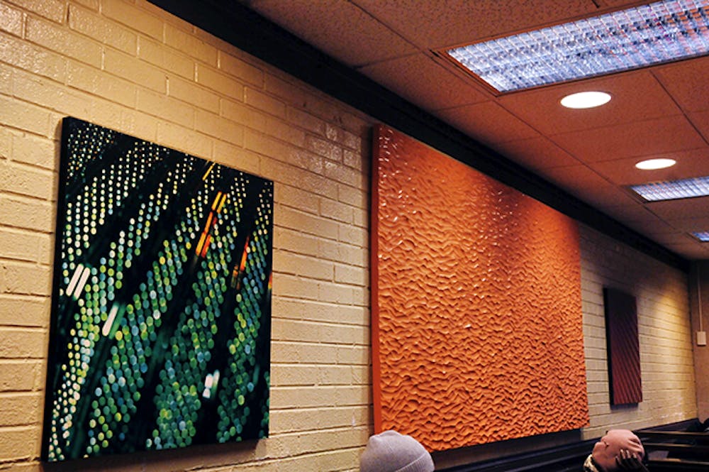
Like any reputable community eatery, the 40th Street McDonald’s has its share of kindly decorative flourishes: the quaint community gathering place, a terrace; the entertainment, a television; and the art, a series of digital prints lining the brightly tiled walls.
The seven pieces—digital photographs printed on plastic, roughly 16” by 16”—heavily feature the photographic technique of bokeh. You probably remember bokeh from your Windows 2001 default desktop wallpapers: points of light are blurred or intentionally unfocused. Others are simply light paintings, created by either moving the camera or using a long exposure to capture bright objects in motion—like writing your name with a glowstick. The effect? It’s that first–time–using–a–digital–camera look, overprocessed and perennially underwhelming. Some of the canvases resemble snakeskin patterns; some evoke streaming headlights of speeding cars. You could spend all night distinguishing images in the patterns (and you probably wouldn’t be the first).
All things considered, these images are like a crude joke from someone who just doesn’t get abstraction. It’s an effort from that kid in your art history course who insists he can simulate a Pollock or Rothko. Sorry, buddy: non–figurative blurs do not an enigmatic masterpiece make. Sourced from the same purveyor of stock canvases that supplies dentists’ offices and hotellobbies, the art is there to be there. You aren’t really supposed to look at it, whether in admiration or critique. They aren’t even canvases—they’re plastic representations of canvases. They’re meant to take up space, to appease some subconscious tickle or satisfy our expectation for a certain normalcy.
As patrons of McDonald’s, do we really deserve more? McDonald’s isn’t in the business of supporting local artists, fostering a love for culture or creating an enriching, holistic dining experience. We appreciate McDonald’s for its staunch uniformity. Our cheeseburger tastes the same as it did when we were eight years old in a different city. It tastes the same to everyone. It’s reliable, accessible and unassuming. We don’t want to confront our mortality or our sublimity as we wait to order a last–minute lunch. We want consistency, and we get it.
So while we love the idea of our cheapest eateries housing hidden gems, folks, you get what you pay for. In this case, we get our art like our Dollar Menu french fries: bland, over–processed and laden with superficial flourishes; wall art in the age of mass–production.

